http://www.datavis.ca/milestones/index.php?group=1950%2B
Star Plots are used to examine the relative values for a single data point. In this case we have sixteen shapes which correspond to a state each. Star plot are defined as "A radar chart is a graphical method of displaying multivariate data in the form of a two-dimensional chart".
Tuesday, November 27, 2012
Similarity matrix
http://www.fxpal.com/?p=eventDetector
Similarity matrices show how similar to points of data are. They are used frequently in sequence alignment.
Similarity matrices show how similar to points of data are. They are used frequently in sequence alignment.
Stem and leaf plot
http://www.webquest.hawaii.edu/kahihi/mathdictionary/S/stemleaf.php
Stem and leaf plots are used to organize data. We learn about them very young in school and they represent a larger data set. In this stem and leaf plot the orgaized chat is really showing twenty-four different numerical values.
Stem and leaf plots are used to organize data. We learn about them very young in school and they represent a larger data set. In this stem and leaf plot the orgaized chat is really showing twenty-four different numerical values.
Box plot
Boxplots are used to display differences in data without making any assumptions of statistical distribution. In this box plot the speed of light in various experiments are being analyzed.
Histogram
A histogram "is a graphical representation showing a visual impression of the distribution of data". In this histogram we have arrivals per minute on the x-axis and then the frequency of the arrivals on the y-axis.
Monday, November 26, 2012
Parallel coordinate graph
http://www.google.com/
Parallell coordinate graphs are used to showing high dimensional geometry. They would be very complex to understand unless you were interested in multi-dimensional space.
Parallell coordinate graphs are used to showing high dimensional geometry. They would be very complex to understand unless you were interested in multi-dimensional space.
Triangular plot
Triangle plots are used to represent three different variables. In this case we are looking at oxygen, nitrogen, and methane.
Windrose
Windrose's look very similar to the compass rose which we navigate North, South, East, and West with. Using a wind rose meteorologists can measure the wind direction in a given area.
Climograph
Climographs show the basic climate parameters, like temperature and precipitation. On this chart temperature is on the right side and the months are on the x-axis. Judging by the chart June through September receive the heaviest amount of precipitation.
Population profile
Population profiles are charts that represent people as a function of thier age. On the chart we have to two quadrants separated between males on the left and females on the right. On this chart the origin is in the middle with the numbers increasing away from it.
Scatterplot
http://en.wikipedia.org/wiki/Scatter_plot
Scatterplots are used to display two or more sets of data using cartesian points. Correlations are formed when you can see a pattern between the points. This particular scatterplot measures input and quality.
Scatterplots are used to display two or more sets of data using cartesian points. Correlations are formed when you can see a pattern between the points. This particular scatterplot measures input and quality.
Index value plot
Index value plots show discrepancies between different datas. As you can see countries like France and US have similar correlations.
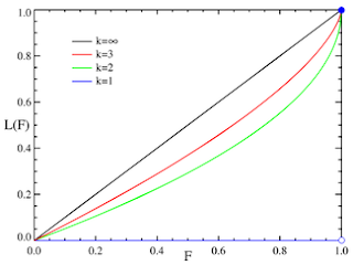
Accumulative line graph or Lorenz curve
http://en.wikipedia.org/wiki/Pareto_distribution#Lorenz_curve_and_Gini_coefficient
The Lorenz curve is often used to characterize income and wealth distributions. The data is represented about the x axis and y axis and inputs are in terms of k.
The Lorenz curve is often used to characterize income and wealth distributions. The data is represented about the x axis and y axis and inputs are in terms of k.
Bilateral graph
Bilateral graphs are used to show data in a graph instead of a normal map. They show different forms of corresponding information about the x and y-axis
Standardized choropleth maps
http://www.statcan.gc.ca/pub/92f0138m/2008003/figures/5200001-eng.htm
Standardized choropleth maps are used to average data. They represent a standard unit which is usually taken by area.
Standardized choropleth maps are used to average data. They represent a standard unit which is usually taken by area.
Univariate choropleth maps
http://www.cdc.gov/pcd/issues/2007/oct/images/07_0091_02.gif
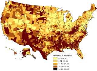
Univariate shows one set of data instead of two like the bivariate. In this case poverty is displayed by different colors.
Univariate shows one set of data instead of two like the bivariate. In this case poverty is displayed by different colors.
Bivariate choropleth maps
http://www.geog.le.ac.uk/russianheartland/DemographicMaps/images/PopulationMaps/RaionMaps/7RaionPopDenPerCh8902.jpg
Bivariate choropleth maps show two of the same regions but with different coloring to display different data.
Bivariate choropleth maps show two of the same regions but with different coloring to display different data.
Unclassed choropleth maps
http://candacesmaps.blogspot.com/2010/12/unclassed-choropleth-maps.html
This map is one of the most interesting maps I have come across. Its interesting due to the fact that all the talk about the 2012 presidential election has passed. In this map you can see the percent of democrats given by the blue and republicans given by the red and how their colors have blended into a purple like color due to a blended mixture of the two parties.
This map is one of the most interesting maps I have come across. Its interesting due to the fact that all the talk about the 2012 presidential election has passed. In this map you can see the percent of democrats given by the blue and republicans given by the red and how their colors have blended into a purple like color due to a blended mixture of the two parties.
Classed choropleth maps
These maps are used to show data through color shading which is explained in the legend or key to the left hand side of the map. In this case we have the state of Florida, hispanic persons are represented by the shading. The dark green shows a heavier population of latinos.
Range graded proportional circle map
https://www.e-education.psu.edu/natureofgeoinfo/book/export/html/1553
This map is similar to the Continuously variable proportional circle map in the fact that it uses circles to represent data although in this map there is more than just one piece of data at work. This map shows the amount of cartography courses in The United States, per state as well as the relative importance of the courses.
This map is similar to the Continuously variable proportional circle map in the fact that it uses circles to represent data although in this map there is more than just one piece of data at work. This map shows the amount of cartography courses in The United States, per state as well as the relative importance of the courses.
Continuously variable proportional circle map
http://kentmacr.blogspot.com/2010/04/range-graded-proportional-circle-map.html
This is a continuously variable proportional circle map of califonia and the motor vehicle deaths shown by red circles. The circles are proportionate to the amount of deaths per region. The smaller the circle the less amount of deaths and vice versa.
Sunday, November 25, 2012
DOQQ
DOQQ stands for digital orthoquarter quads these maps are developed from raster images from aerial photos. This particular picture above is a red colored DOQQ of a flood plain.
DEM
http://en.wikipedia.org/wiki/Digital_elevation_model
DEMs are basically 3-D maps of the earth or other planets. These maps give you a rendering of your environment so you can see elevation.
DEMs are basically 3-D maps of the earth or other planets. These maps give you a rendering of your environment so you can see elevation.
DLG
Digital line graphs represent the zoning in the county levels and are made on autoCad. This map is of Illinois.
DRG
http://egsc.usgs.gov/isb/pubs/factsheets/fs08801.html
DRG maps stand for digital raster graphic, the one above is from Washington D.C. This is done by scanning a topographic map onto a computer.
DRG maps stand for digital raster graphic, the one above is from Washington D.C. This is done by scanning a topographic map onto a computer.
Isopleth
http://dwb4.unl.edu/Chem/CHEM869V/CHEM869VLinks/weather.about.com/newsissues/weather/library/weekly/aa071600a.htm
This isopleth map measures the hydrogen ion concentration of pH levels throughout the country. It seems as there is a fine line where the green shade turns to orange/red.
Isopach
http://seeps.geol.ucsb.edu/pages/isopach.html
An isopach map is a map used to measure thickness within a tabular unit. In this map we see the sediment overburden depicted but the rainbow colors.
An isopach map is a map used to measure thickness within a tabular unit. In this map we see the sediment overburden depicted but the rainbow colors.
Isohyets
http://www.scoop.co.nz/stories/AK0808/S00090.htm
Isohyets are used to display rainfall in a particular region like in this mp we see the specific lines which get larger in value as they approach the center of the forrest. This indicates heavier rainfall in those regions.
Isohyets are used to display rainfall in a particular region like in this mp we see the specific lines which get larger in value as they approach the center of the forrest. This indicates heavier rainfall in those regions.
Isotach
http://www.atmos.washington.edu/~mcmurdie/oct96/oct96_labs.html
Isotach maps are used to measure windspeed. Where the lines connect you are able to infer the wind speed of the given line.
Isotach maps are used to measure windspeed. Where the lines connect you are able to infer the wind speed of the given line.
Isobars
http://www.google.com
Isobars show the amount of pressure between two or more points. As you can see here the blue are low pressure areas and the red is high.
Isobars show the amount of pressure between two or more points. As you can see here the blue are low pressure areas and the red is high.
LIDAR
noaanews.noaa.gov
LIDAR stands for light detection and range. Using this equipment it was able to do a 3-D mapping of lower manhattan which is shown above. Lidar is able to do this by measuring light waves for accurate distancing.
Black and White Aerial
http://egsc.usgs.gov/isb/pubs/booklets/aerial/aerial.html
This is a black and white aerial photo that I found from the USGS. I am not quite sure what town it of but aerials have been taken for many years to show what the land looks like from a top view, this can be done for land development or just for cool pictures.
This is a black and white aerial photo that I found from the USGS. I am not quite sure what town it of but aerials have been taken for many years to show what the land looks like from a top view, this can be done for land development or just for cool pictures.
Infrared Aerial photo
http://www.aerialarchives.com/Infrared-Aerial-Photography.htm
Infrared Aerials are very cool types of maps. When one looks at a photo its hard to tell at first what you are visualizing. Photos like this are used to track changes in the environment.
Cartographic animation
http://images.apple.com/downloads/dashboard/information/images/radarinmotion_20070608173303.jpg
Cartographic animations show animations such as cloud formations, hurricanes, wind movement, and many more that are helpful to people many of which they use on weather channels. It is easier to understand what large weather fronts are doing when you can visualize through the help of satellites.
Statistical Map
http://personalpages.manchester.ac.uk/staff/m.dodge/cybergeography/atlas/census.html
Statistical maps are used to show data represented by color or percentages. In this map International connectivity is shown, the areas in purple are those areas with internet and the yellow represents areas without internet. It is crazy to see how much of our globe actually has internet.
Statistical maps are used to show data represented by color or percentages. In this map International connectivity is shown, the areas in purple are those areas with internet and the yellow represents areas without internet. It is crazy to see how much of our globe actually has internet.
Cartogram
http://en.wikipedia.org/wiki/Cartogram
Cartograms are maps in which travel times, population, or GNP decides distance area. This is a cartogram of Germany which doesn't really look like Germany because of all the distortions based on population
Cartograms are maps in which travel times, population, or GNP decides distance area. This is a cartogram of Germany which doesn't really look like Germany because of all the distortions based on population
Flow Map
http://www.mekongmigration.org/?page_id=
Flow maps depict how certain criteria are disbursed throughout the certain part of the map. This can be on a world scale or down to state and counties. In this flow map we see how migration flows throughout Mekong and the region.
Flow maps depict how certain criteria are disbursed throughout the certain part of the map. This can be on a world scale or down to state and counties. In this flow map we see how migration flows throughout Mekong and the region.
Friday, November 23, 2012
isoline map
http://www.learner.org/jnorth/images/graphics/u-z/weather_isotherm032401.gif
The isoline map featured here displays temperatures throughout the country. With hot temperatures in red and freezing temperatures in the white. This map is from 2001
The isoline map featured here displays temperatures throughout the country. With hot temperatures in red and freezing temperatures in the white. This map is from 2001
Proportional circle maps
I remember a map similar to this on the second test and proportional circle maps are used to display information like population based on the size of the circle on the map. For instance the largest dot is on california because it has the largest population of mexicans, and the smallest(shown on this map) is North Dakota because no mexicans apparently live there.
Chloropleth Map
http://www.google.com/
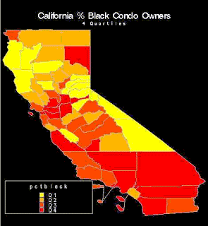
For my Chloropleth map I chose this map of California which depicts black Condo owners. I'm not entirely sure why this map was constructed but perhaps it was made for real estate purposes.
For my Chloropleth map I chose this map of California which depicts black Condo owners. I'm not entirely sure why this map was constructed but perhaps it was made for real estate purposes.
Dot Distribution Map
http://www.google.com
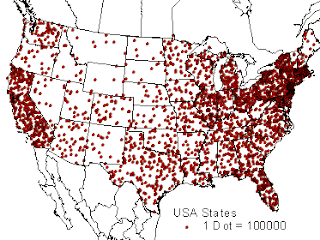
This is a dot distribution map which shows population in the United States 1 dot represents one hundred thousand people as as you can se places like California and the upper north east are the most densely populated.
This is a dot distribution map which shows population in the United States 1 dot represents one hundred thousand people as as you can se places like California and the upper north east are the most densely populated.
Propaganda Map
This is a propaganda map of europe showing the bear as Russia and a few other figures attacking and eagle which represents The United States.
Hypsometric maps
http://www.google.com/
This Hysometric map is of the small island of borneo the contour of Borneo with the green color being closer to sea level and then gaining elevation as you move to the yellow portions of the map. These maps are useful when you need to know the terrain so you dont go hiking and expect to be on flat surface and then find a huge mountain in front of you.
This Hysometric map is of the small island of borneo the contour of Borneo with the green color being closer to sea level and then gaining elevation as you move to the yellow portions of the map. These maps are useful when you need to know the terrain so you dont go hiking and expect to be on flat surface and then find a huge mountain in front of you.
PLSS Map
http://www.google.com/imgres?
For my PLSS map I have chosen one from the USGS. PLSS stands for public land survey system which breaks up areas of land into different sections by township and eventual ownership. On this map you can see the township numbers on the left and the range numbers on the top.
For my PLSS map I have chosen one from the USGS. PLSS stands for public land survey system which breaks up areas of land into different sections by township and eventual ownership. On this map you can see the township numbers on the left and the range numbers on the top.
Cadastral Map
http://elcoco.co/new-cadastral-maps-provide-better-security-for-property-in-costa-rica/
This is a Cadastral map of some land in Costa Rica. Cadastral maps are used to show property ownership. In this map the use of a cadastral map is important because it displays who owns what and all the property lines you can see the individual properties in the pink and then in yellow you can see other properties on the outskirts of the town.
This is a Cadastral map of some land in Costa Rica. Cadastral maps are used to show property ownership. In this map the use of a cadastral map is important because it displays who owns what and all the property lines you can see the individual properties in the pink and then in yellow you can see other properties on the outskirts of the town.
Monday, October 29, 2012
Thematic Map
http://soils.usda.gov/use/thematic/dv_soilmap_high.html
This map seemed like a good representation of a Thematic Map. It was hard to find a map on Google that hadn't already been taken by someone else's blog but when i found this one I thought it was cool enough to use. This map shows the United States of America and the drought spots throughout the county in red. Thematic maps are good to display information like this another good use is a map of population and anythings that is distributed throughout an area.
This map seemed like a good representation of a Thematic Map. It was hard to find a map on Google that hadn't already been taken by someone else's blog but when i found this one I thought it was cool enough to use. This map shows the United States of America and the drought spots throughout the county in red. Thematic maps are good to display information like this another good use is a map of population and anythings that is distributed throughout an area.
Topographic Map of Mars
http://sos.noaa.gov/Datasets/dataset.php?id=227
Considering all the talk in the news lately about mars I decided for my topographic Map I would do one of Mars. If you're unfamiliar with whats been going on about mars we have recently landed a rover o it's surface and much talk about colonizing mars has been in the media. This is a good display of topography because you can see the contours that are on the planet mars some of its largest features like its enormous volcano; Olympus Mons.
Considering all the talk in the news lately about mars I decided for my topographic Map I would do one of Mars. If you're unfamiliar with whats been going on about mars we have recently landed a rover o it's surface and much talk about colonizing mars has been in the media. This is a good display of topography because you can see the contours that are on the planet mars some of its largest features like its enormous volcano; Olympus Mons.
Although this map is harder to see I thought it was an interesting planimetric Map because I found it in florida states index. After looking it over for a few minutes its hard to make out the names and I cant really tell exactly which part of campus it is. This is a good description of a planimetric map because it doesnt convey land contour only the horizontal/vertical lines.
Mental Maps
http://www.google.com
The type of map that I chosen to discuss this time in a picture I found off of google of someone's attempt of a mental map. I though this was a good choice for my description of a mental map because I remember back when I was younger trying to draw maps of my neighborhood based soley on memory of the area. Mental maps are good for basic streets and houses like this one here but would be hard for most people to make mental maps of very complex areas like cities or large scale items.
Wednesday, September 5, 2012
Doppler Radar of A Hurricane Over Florida
http://deadlystorms.com/storms/2004/2004%20charley/videos.htm
What you are looking at is a map of Florida as a hurricane approaching from the Gulf of Mexico hits the west coast. If it wasn't for maps like this people would have no idea of the approaching storm. These maps are used by all weather forecasters to show what the human eye can not see and to predict potentially disastrous weather in the future. Doppler radars come from satellite images and usually show a certain time frame so you can see the direction of a storm front. Doppler radars are also very important for aviation so that pilots can see what kind of skies they are heading into.
Doppler radars work by sending microwave signals through space and waiting for a returning frequency to analyze the depth of the weather. It is a very important tool and these maps will continue to save lives and help people for many years to come.
Subscribe to:
Comments (Atom)


